At this point, we have a decent component. However, if we want to share it with others (especially non-developers), its utility is limited. It will only offer a choice between Apples and Pears. While this was perfect for our first customer (probably a fruit cake factory), the automotive company we are working on next will probably not use Augmented Reality to help workers choose fruit in the break room. It's time to make our components more reusable and configurable.
You already know how to configure components. Upon selecting a component on the workflow flowchart, the component configuration panel will pop up on the right side of the workflow flowchart with the configuration options.
Making components configurable consists of two parts, defining what the user can configure and processing the selected values.
Defining the configuration options
The configuration options you want to offer are defined in JSON format. Users can choose from a range of input types, such as simple text input, checkbox input, and file upload input.
Here is an example configuration.
{
  "tab1": {
        "title_text": {
            "title": "Title",
            "inputType": "textinput",
            "value": "Please select"
        }
  },
  "tab2": {
        "options": {
            "title": "Options",
            "inputType": "map-input",
            "placeholder": {
                "key": "Option Key",
                "value": "Option Title"
            },
            "value": [
                {
                    "key": "option1",
                    "value": "Option 1"
                },
                {
                    "key": "option2",
                    "value": "Option 2"
                },
                {
                    "key": "option3",
                    "value": "Option 3"
                }
            ]
        },
         "use_all": {
             "title": "Offer last option",
             "inputType": "checkbox-input",
             "value": "true"
         }
  }
}
The objects at the root level of the JSON file are the tabs of the configuration panel (their key will be shown as the title of the tab). Each input field object has at least three attributes:
- a
titlewhich is the headline shown above the input field in the configuration panel - an
inputTypewhich is the type of input field you want to be shown - a
value: which is what the user entered into the input field (or a default value)
You can also add an info attribute, which will be rendered as a tooltip and can be used for a more detailed explanation of the purpose of the input field.
Additionally, many specific attributes are possible depending on the input type used.
There are advanced techniques available, that allow you to improve the UI of the configuration panel. For example, it is possible to group multiple input fields into repeatable, collapsible containers, or to show certain input fields only conditionally. These will be shown in the following examples.
Processing selected values
Once you have defined the configuration, it is time to embed the configured values into your component. You can access the configuration file values using §{ ... }§. Inside the brackets, you can use dot notation to access the configuration object. These placeholders are replaced with the configured values in a pre-compilation step.
For example, you could create a mapping to include the "Title" value we defined in the above example in your step layout like this:
<mapping>
    <ui_element name="Topic">
        <param name="content">§{ tab1.title_text.value }§</param>
    </ui_element>
</mapping>
Tips & tricks: A typical mistake when accessing the configuration is to forget the closing ".value".
You can also use helper functions to implement your configuration. These functions help you do many things, like:
- implement rules that are only added to the workflow conditionally based on the configuration
- loop through configured values and create rules/actions/... for each value
- manipulate the configured values for further processing
Let's look at an example of helper usage as well:
§{#each tab2.options.value}§
    §{#unless @last}§
    <rule id="opt_§{key}§">
        <expression><![CDATA[ #{event:command} == '§{value}§' ]]></expression>
        <actions>
            <action ref="set_command"/>
        </actions>
    </rule>
    §{/unless}§

    §{#if @last}§
    §{#if (and tab2.use_all.value (compare (collection tab2.options.value "size") ">" 1))}§
        <rule id="special_opt_§{key}§">
            <expression><![CDATA[ #{event:command} == '§{value}§' ]]></expression>
            <actions>
                <action ref="special_action"/>
            </actions>
        </rule>
    §{/if}§
    §{/if}§
§{/each}§
There are a couple of important points to note here:
- The
#in front of the helper functions is required and signals that it enframes and refers to a block of code. - You can nest helper functions and they get evaluated from the inside out. In this example the
collectionhelper returns a size of 3 which is thencompared to 1 resulting in true. After applying a "logical and" on this result and the value of the checkbox-input, we get a final Boolean value for our if-helper-function. - There are several automatically set variables inside some block helpers that help you manage your position in arrays/maps of data. These are
@first,@last,@indexand@key.
After pre-compilation with the above example configuration this would result in:
    <rule id="opt_option1">
        <expression><![CDATA[ #{event:command} == 'Option 1' ]]></expression>
        <actions>
            <action ref="set_command"/>
        </actions>
    </rule>

    <rule id="opt_option2">
        <expression><![CDATA[ #{event:command} == 'Option 2' ]]></expression>
        <actions>
            <action ref="set_command"/>
        </actions>
    </rule>

    <rule id="special_opt_option3">
        <expression><![CDATA[ #{event:command} == 'Option 3' ]]></expression>
        <actions>
            <action ref="special_action"/>
        </actions>
    </rule>
Examples
The following two examples show advanced ways to make your component configuration easier to understand.
Grouping of input fields
You can group multiple input fields using the inputType "container". This allows for some visual clarity and also enables functionality like the duplication of a group of elements.
Here are some specific attributes and their descriptions.
- container group: Differentiates between different types of groups. This can be used to go over containers in the workflow markup.
- repeatable: Enables the user to create copies of a group. These can be changed separately, which enables the implementation of repeatable elements.
- collapsible: Allows the group to be minimized, leaving only the title to be shown.
- deletable: Removes a container from the configuration. It is set automatically for copied containers and should not be used for base containers.
- editable: Enables the user to change the title of the container.
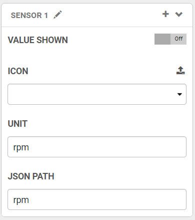
"base_sensor": {
            "title": "Sensor 1",
            "inputType": "container",
            "containerGroup": "sensors",
            "repeatable": true,
            "collapsible": true,
            "deleteable": false,
            "editable": true,
            "value": {
                "sensor_shown": {
                    "title": "Value Shown",
                    "inputType": "checkbox-input",
                    "value": false,
                    "showIfComputed": true
                },
                "sensor_type": {
                    "inputType": "file-upload",
                    "title": "Icon",
                    "accept": "image/png",
                    "multiple": false,
                    "value": "",
                    "showIfComputed": true
                },
                "sensor_unit": {
                    "title": "Unit",
                    "inputType": "textinput",
                    "value": "rpm",
                    "showIfComputed": true
                },
                "sensor_json_path": {
                    "title": "JSON Path ",
                    "inputType": "textinput",
                    "value": "rpm",
                    "showIfComputed": true
                }
            },
            "showIfComputed": true,
            "container_editing": false,
            "container_opened": true
        }
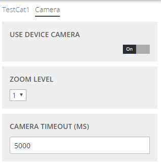
Conditional display of input fields
It is possible to use the "showif" attribute to define a condition under which an input field should be shown or hidden. Assume, for example, that your component has an optional feature that can be configured in detail. If the feature isn't used at all, then you wouldn't want to show the detailed configuration parameters.
Let's look at an example:
{
  "Camera":{
    "use_camera":{
      "title": "Use Device Camera",
      "inputType": "checkbox-input",
      "value": "false"
    },
    "zoom_level":{
      "title": "Zoom Level",
      "inputType": "dropdown-input",
      "showIf": "root.Camera.use_camera.value",
      "value": { "name": 1 },
      "elements": [
        {
          "name": 1
        },
        {
          "name": 2
        },
        {
          "name": 3
        }
      ]
    },
    "show_zoom_level": {
      "title": "Show Zoom Level",
        "inputType": "checkbox-input",
        "showIf": "root.Camera.use_camera.value && root.Camera.zoom_level.value.name > 1",
        "value": "false"
    },
    "timeout":{
      "title": "Camera Timeout (ms)",
      "showIf": "root.Camera.use_camera.value",
      "inputType": "textinput",
      "value": 5000
    }
  }
}
Below you can see the expected output.
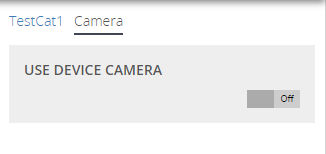
Since the checkbox is set to false, all other input fields are not shown. If it were true, all but the "Show Zoom Level" checkbox would appear since that checkbox only appears if the Zoom Level is higher than one:
📌Assignment
- Add configuration fields for the title, as well as the image and text on the two buttons.
- Show the images only if an image exists for both buttons. If only one button has an image configured, only show the text.
Download Component (Pre-Assignment)
Help & Resources
Accessing the configuration in layout files:
Within attributes of layout tags, you can access the configuration as always:
<Button Name="§{ ... }§" .../>
For block helper functions, however, you will have to use a <Script> like this:
<Script>§{#if ...}§</Script>
<Button .../>
<Script>§{/if}§</Script>
It is also important to note, that you will not be able to use the <Script> tag within all other tags. Below is an invalid example:
<Button>
<Script>§{#...}§</Script>
...
<Script>§{/...}§</Script>
</Button>
Finally, if your conditionals result in a syntax error Duplicate unique value, because an element name exists twice but you are sure that only one of them will exist at a time after pre-compilation, you can ignore the syntax error.
Solution
Below is an exemplary solution for the layout:
<LayoutModel Name="ChoiceScreen" Page="DefaultMaster" Orientation="Vertical">
  <Content PlaceHolder="Content" Weight="1" Orientation="Horizontal">
    <Script>§{#if (and (compare configuration.leftImage.value.image.value "!=" "") (compare configuration.rightImage.value.image.value "!=" ""))}§</Script>
    <Button Name="§{configuration.leftImage.value.text.value}§" FocusOrder="0" Weight="0.5" Style="ImageButtonStyle">
      <Image Name="LEFT_IMAGE" Weight="0.8" Margin="0,0,0,0" Content="§{configuration.leftImage.value.image.value}§" ScaleType="CenterCrop"/>
      <Text Name="LEFT_TEXT" Style="FooterButtonTextStyle" Weight=".2" MaxSize="30" Content="§{configuration.leftImage.value.text.value}§"/>
      <Events/>
    </Button>
    <Script>§{else}§</Script>
    <Button Name="§{configuration.leftImage.value.text.value}§" FocusOrder="0" Weight="0.5" Style="ImageButtonStyle">
      <Text Name="LEFT_TEXT" Style="FooterButtonTextStyle" Weight="1" MaxSize="30" Content="§{configuration.leftImage.value.text.value}§"/>
      <Events/>
    </Button>
    <Script>§{/if}§</Script>

    <Script>§{#if (and (compare configuration.leftImage.value.image.value "!=" "") (compare configuration.rightImage.value.image.value "!=" ""))}§</Script>
    <Button Name="§{configuration.rightImage.value.text.value}§" FocusOrder="1" Weight="0.5" Style="ImageButtonStyle">
      <Image Name="RIGHT_IMAGE" Weight="0.8" Margin="0,0,0,0" Content="§{configuration.rightImage.value.image.value}§" ScaleType="CenterCrop"/>
      <Text Name="RIGHT_TEXT" Style="FooterButtonTextStyle" Weight=".2" MaxSize="30" Content="§{configuration.rightImage.value.text.value}§"/>
      <Events/>
    </Button>
    <Script>§{else}§</Script>
    <Button Name="§{configuration.rightImage.value.text.value}§" FocusOrder="1" Weight="0.5" Style="ImageButtonStyle">
      <Text Name="RIGHT_TEXT" Style="FooterButtonTextStyle" Weight="1" MaxSize="30" Content="§{configuration.rightImage.value.text.value}§"/>
      <Events/>
    </Button>
    <Script>§{/if}§</Script>

  </Content>
</LayoutModel>
Download Component (Post-Assignment)
Accessing the configuration from within layout files like this can be messy. If you run into a similar situation again, it might be worthwhile to take a look at our wildcard widget UI element. This element can be dynamically edited during runtime.
A solution with the wildcard widget would look like this:
First, you would create two PartTemplates with the two-button variants.
<PartTemplate Name="OptionButtonsWithImage" Orientation="Horizontal">
  <Button Name="§{configuration.rightImage.value.text.value}§" FocusOrder="0" Weight="0.5" Style="ImageButtonStyle">
    <Image Name="RIGHT_IMAGE" Weight="0.8" Margin="0,0,0,0" Content="§{configuration.rightImage.value.image.value}§" ScaleType="CenterCrop"/>
    <Text Name="RIGHT_TEXT" Style="FooterButtonTextStyle" Weight=".2" MaxSize="30" Content="§{configuration.rightImage.value.text.value}§"/>
    <Events/>
  </Button>
  <Button Name="§{configuration.leftImage.value.text.value}§" FocusOrder="1" Weight="0.5" Style="ImageButtonStyle">
    <Image Name="LEFT_IMAGE" Weight="0.8" Margin="0,0,0,0" Content="§{configuration.leftImage.value.image.value}§" ScaleType="CenterCrop"/>
    <Text Name="LEFT_TEXT" Style="FooterButtonTextStyle" Weight=".2" MaxSize="30" Content="§{configuration.leftImage.value.text.value}§"/>
    <Events/>
  </Button>
</PartTemplate>
<PartTemplate Name="OptionButtonsText" Orientation="Horizontal">
  <Button Name="§{configuration.leftImage.value.text.value}§" FocusOrder="0" Weight="0.5" Style="ImageButtonStyle">
    <Text Name="LEFT_TEXT" Style="FooterButtonTextStyle" Weight="1" MaxSize="30" Content="§{configuration.leftImage.value.text.value}§"/>
    <Events/>
  </Button>
  <Button Name="§{configuration.rightImage.value.text.value}§" FocusOrder="1" Weight="0.5" Style="ImageButtonStyle">
    <Text Name="RIGHT_TEXT" Style="FooterButtonTextStyle" Weight="1" MaxSize="30" Content="§{configuration.rightImage.value.text.value}§"/>
    <Events/>
  </Button>
</PartTemplate>
Your LayoutModel just includes the "WildcardWidget".
<LayoutModel Name="ChoiceScreen" Page="DefaultMaster" Orientation="Vertical">
  <Content PlaceHolder="Content" Weight="1" Orientation="Horizontal">
    <WildcardWidget Name="Options" PartTemplateName="OptionButtonWithImage" Weight="1"/>
  </Content>
</LayoutModel>
Finally, in the workflow, you set the PartTemplate you want to use based on the configuration:
<mapping>
    <ui_element name="Options">
        <param name="parttemplatename">§{#if (and (compare configuration.leftImage.value.image.value "!=" "") (compare configuration.rightImage.value.image.value "!=" ""))}§OptionButtonsWithImage§{else}§OptionButtonsText§{/if}§</param>
    </ui_element>
</mapping>
This way, you would avoid any syntax errors and special cases when accessing the configuration from within layout files.